Designing Levad: A Journey with Lavender
The design process for Levad began by immersing ourselves in the essence of lavender. We learned about its soft colors, gentle shapes, and soothing qualities. This understanding became the foundation of our creative work.
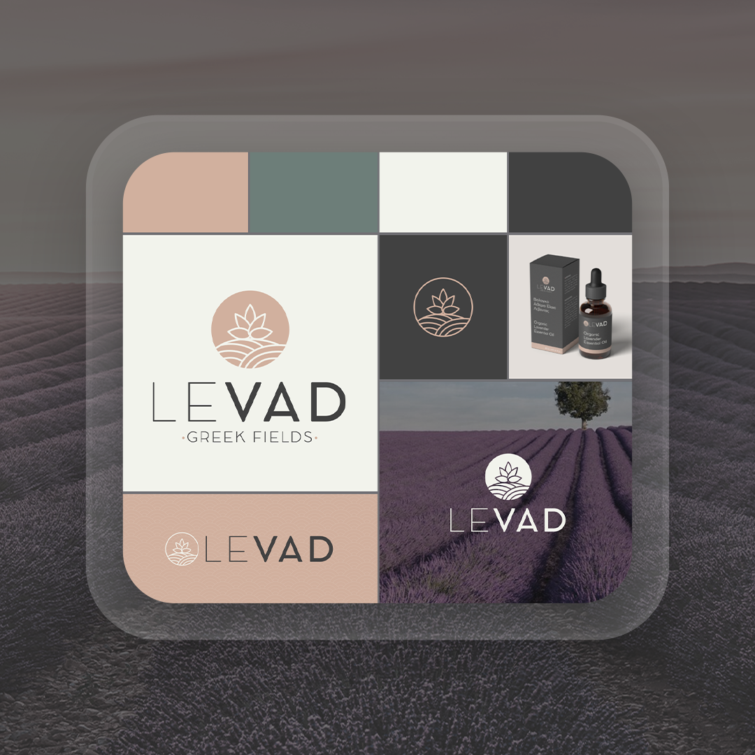
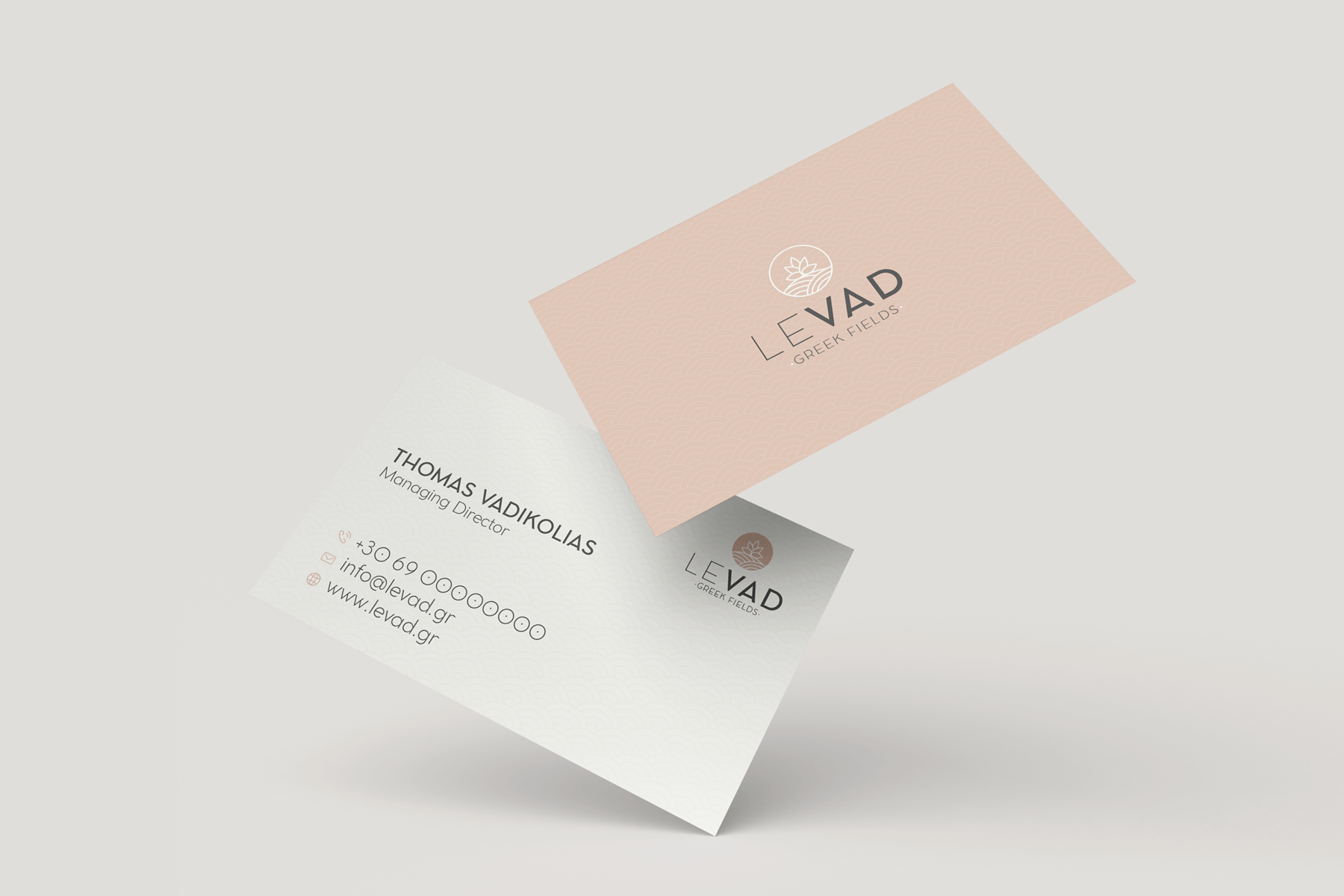
The logo captures the graceful nature of lavender with flowing lines and clean shapes. We carefully chose colors - soft lavenders and muted greens - to reflect the brand's dedication to purity. The design of business materials like typography and patterns was simple and modern, using easy-to-read fonts. Pictures of lavender fields and plants tied everything together.
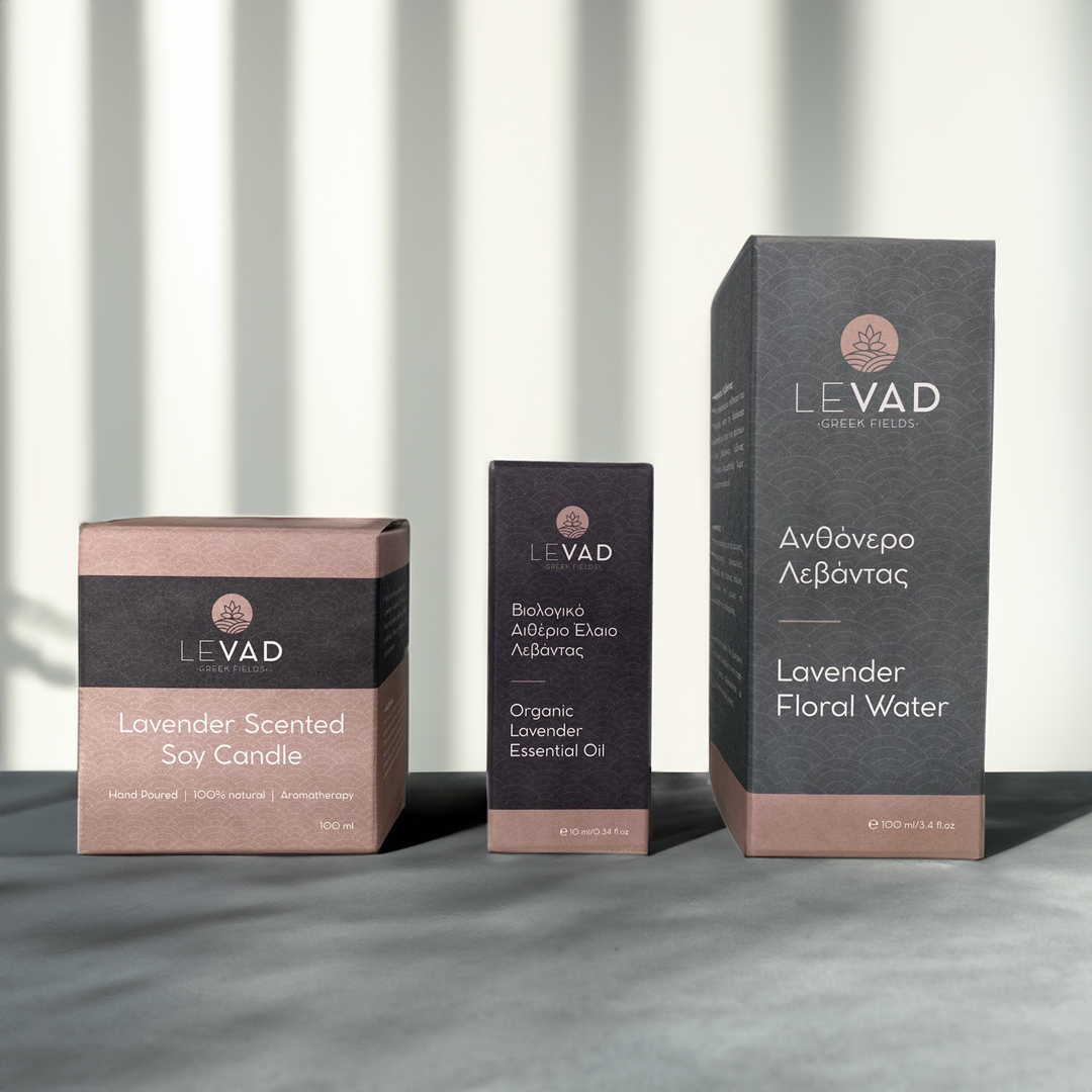
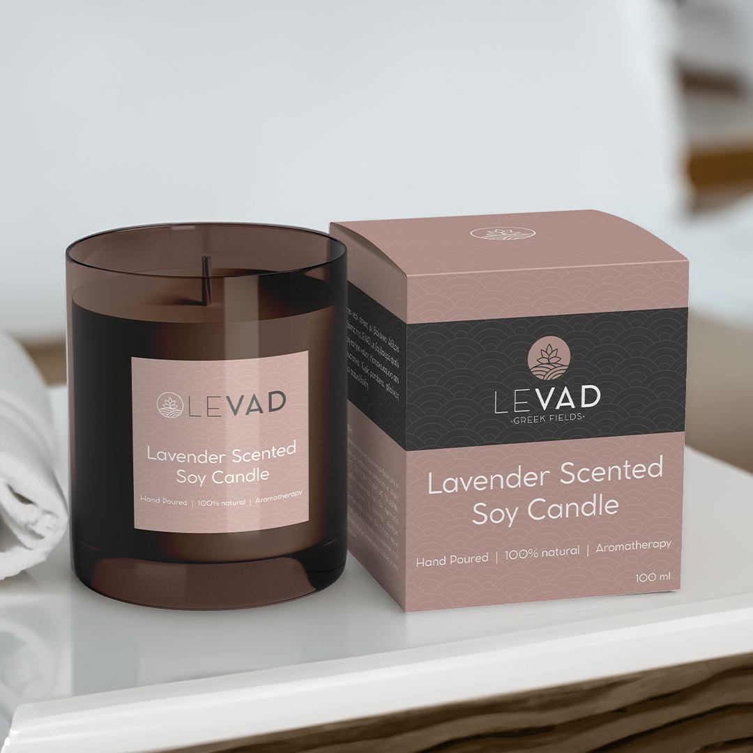
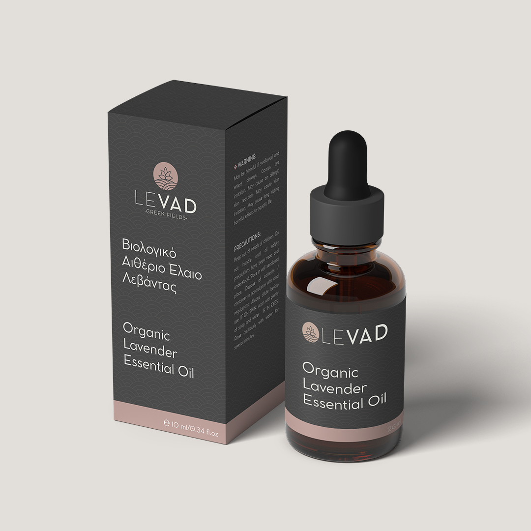
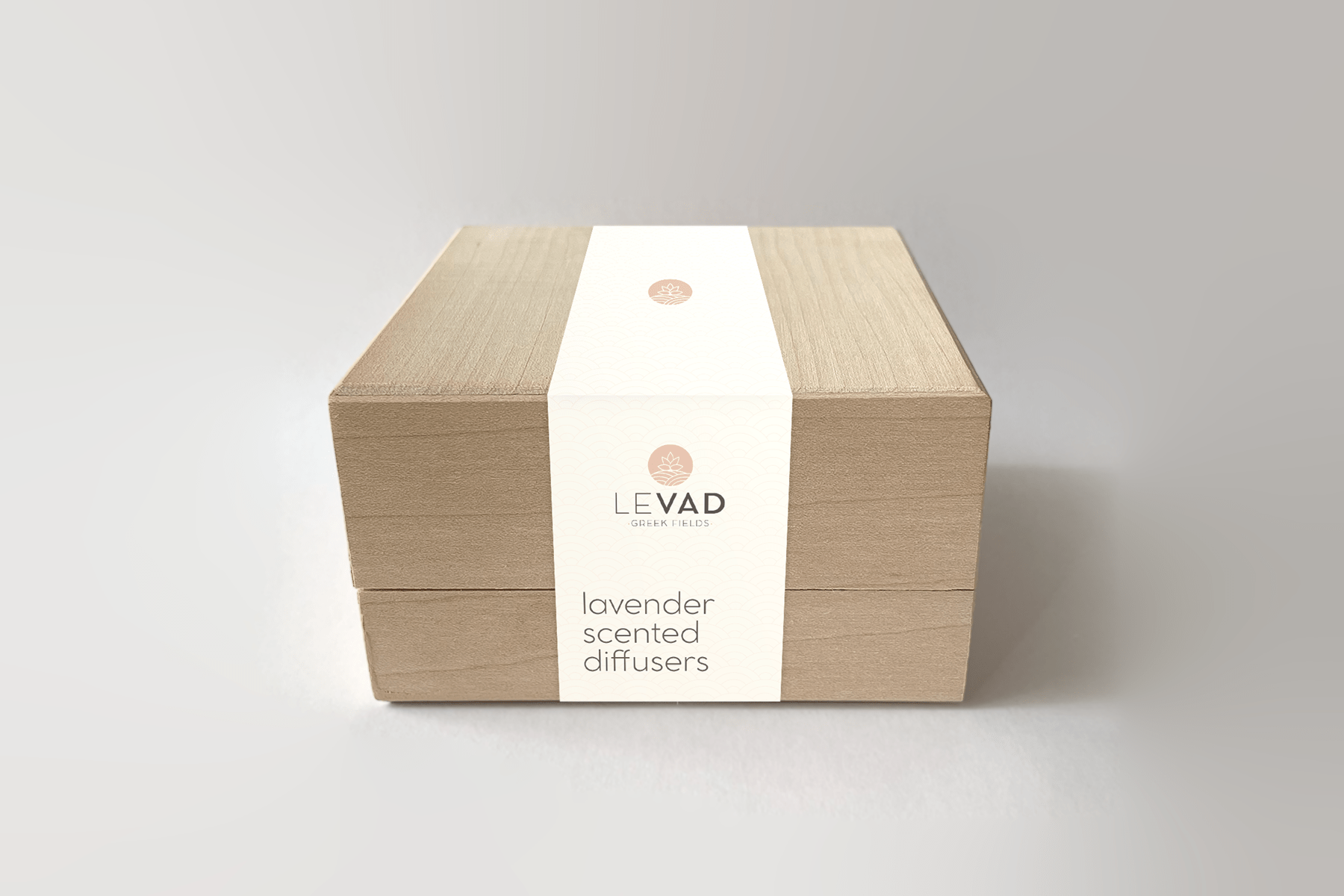
For product design, we kept things natural and uncomplicated. The packaging and the labels were simple but inviting. Every choice, from materials to small details, was made with Levad's values in mind. Our design journey was about understanding and caring, creating an experience that speaks to the heart. Levad's look invites people to enjoy the calm and beauty found in lavender.
