

Presenting Kirki: A Lavender-Inspired Story
Designing Kirki was a journey steeped in the essence of lavender. We delved into its soft colors, graceful shapes, and calming qualities, laying the foundation for a portfolio project that captures our dedication to simplicity and aesthetics.
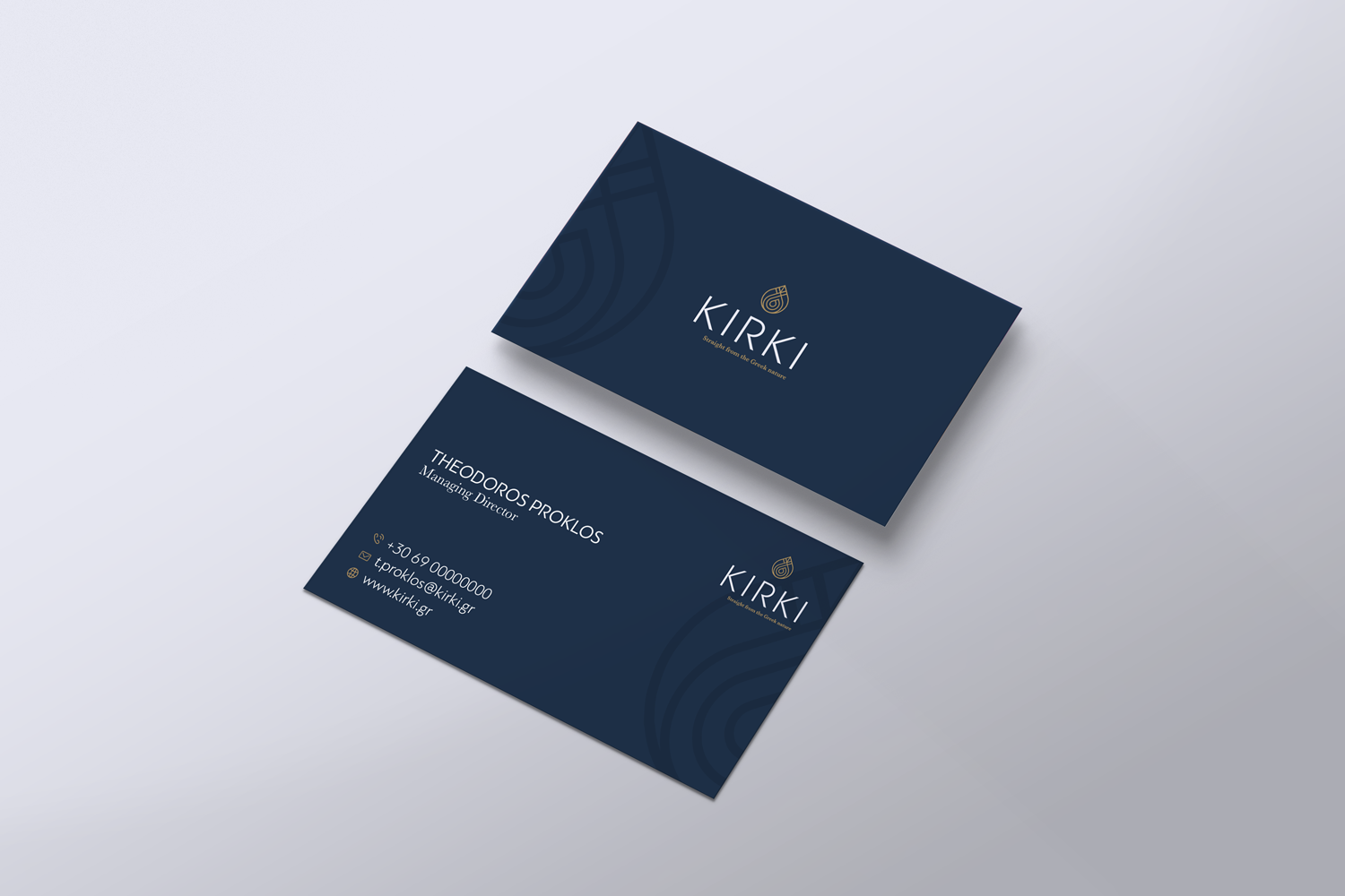
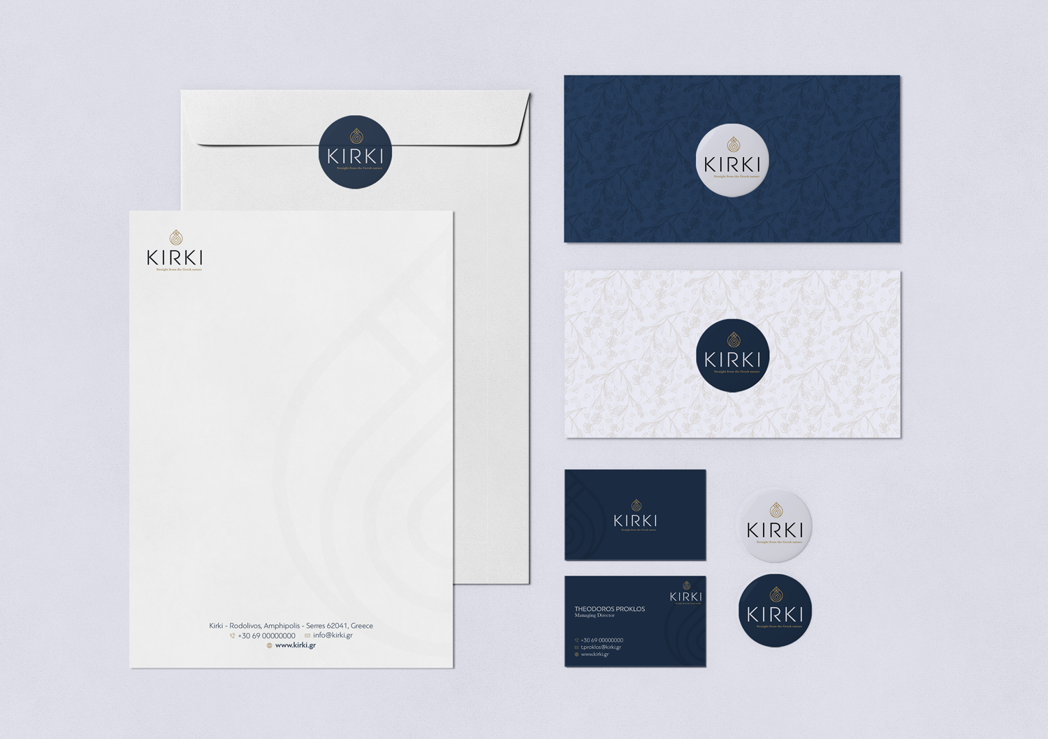
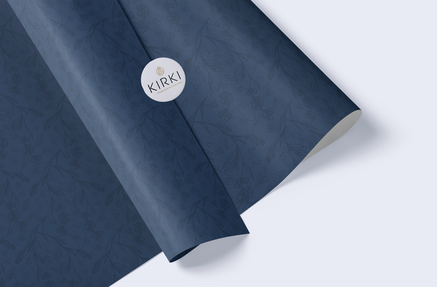
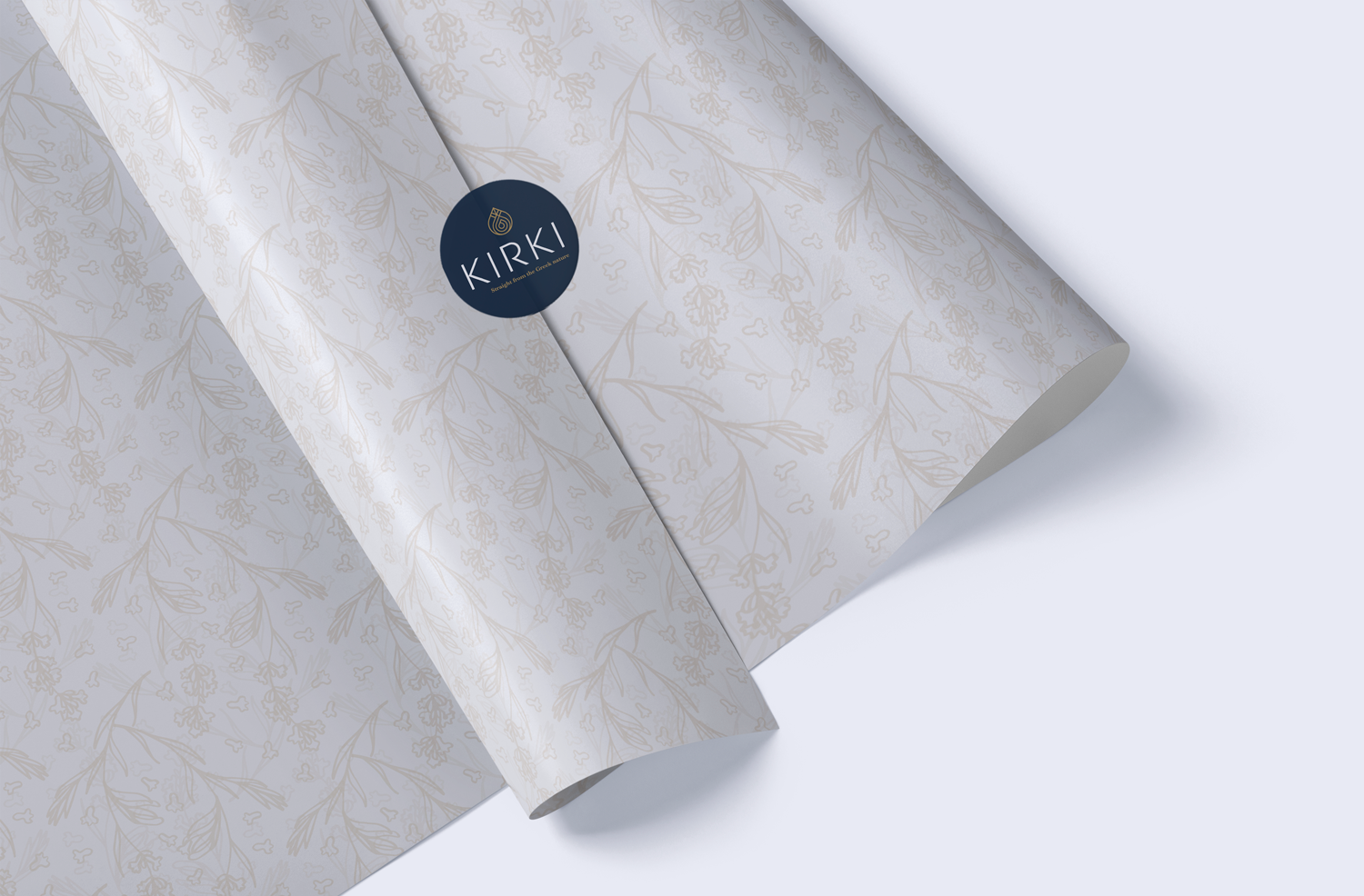
The logo mirrors lavender's grace with fluid lines and clean shapes, complemented by a palette of soft lavenders and muted greens. Business materials, featuring simple and modern typography, alongside patterns, offer a cohesive and inviting brand experience. Evocative visuals of lavender fields tie everything together seamlessly.
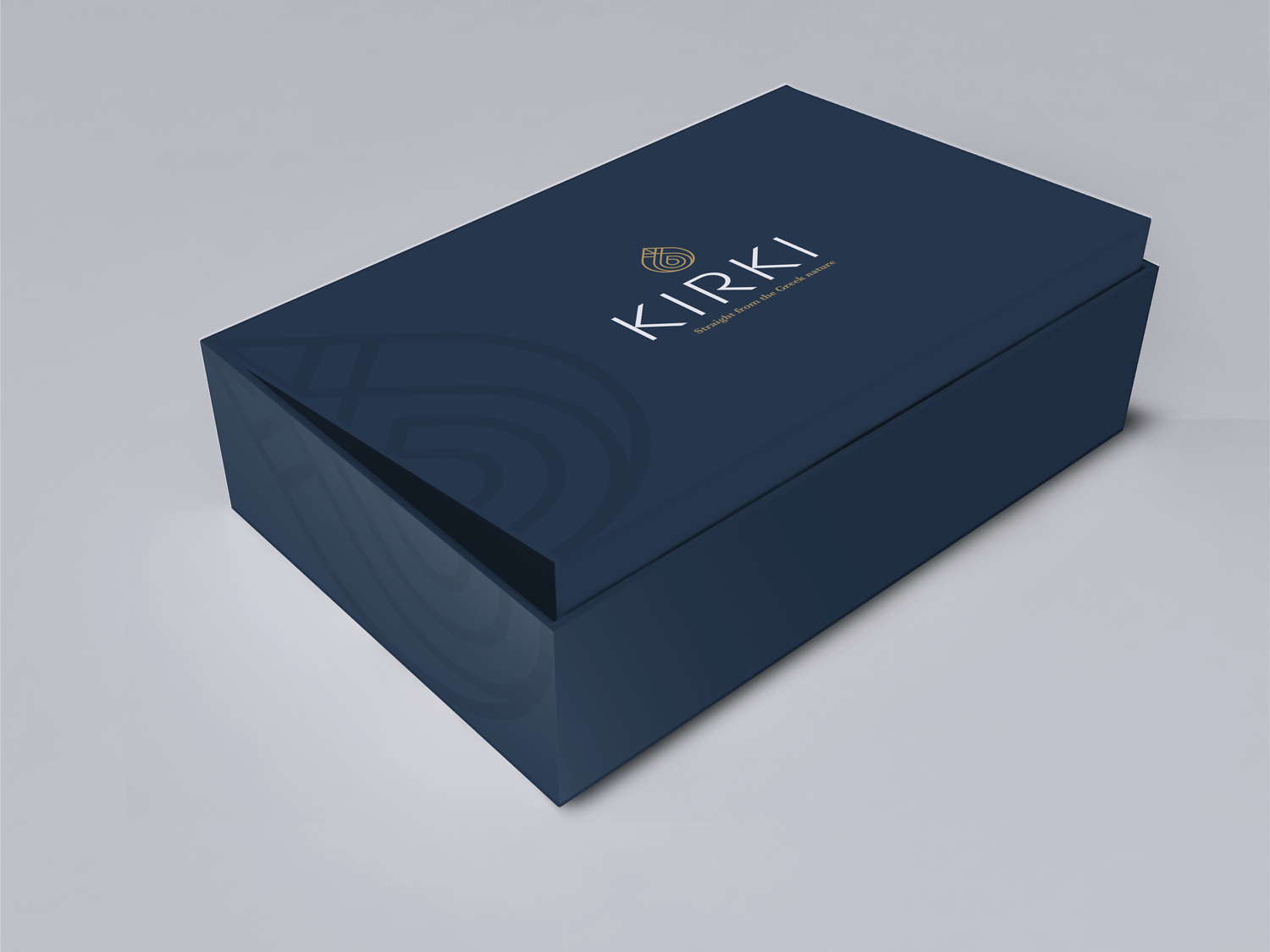
In product design, we embraced natural simplicity for packaging and labels, creating an elegant yet warm appeal. Each choice, from materials to details, aligns with Kirki's values. This portfolio project encapsulates our design journey, offering a glimpse into an experience that resonates with the heart, inviting others to explore the tranquility and beauty found in lavender through Kirki's aesthetic.